DESIGN WORK
A COLLECTION OF GRAPHIC AND WEB DESIGN PROJECTS.
A COLLECTION OF GRAPHIC AND WEB DESIGN PROJECTS.
This twelve-page magazine expertly blends grid-based editorial design with seamless digital and physical production techniques.
Adobe InDesign
This responsive, custom-coded website seamlessly translates print layouts into a functional, minimalist digital experience.
Visual Studio Code
This project establishes a rugged brand identity across print, digital packaging, and mobile platforms.
Adobe Illustrator - Adobe InDesign - Adobe After Effects - Figma
This high-impact billboard uses bold typography and minimalist layout to communicate institutional value quickly.
Adobe Photoshop
This branded content series utilizes mixed media to boost program engagement across social platforms.
Adobe Express
This project modernizes an outdated platform into a responsive, high-performing WordPress site for clients.
WordPress
This motivational piece balances aesthetic typography with technical large-format printing and professional window installation.
Adobe Illustrator
This production demonstrates comprehensive creative direction, from script writing and filming to professional narrative editing.
Adobe Premiere Pro
This project showcases diverse subjects through unique compositions, presented via a custom-designed digital portfolio.
Adobe Lightroom Classic - Canon R10
This tactile gatefold guide uses image-driven layouts and natural textures to reinforce rugged branding..
Adobe InDesign
This large-scale historical project organizes complex data into a readable, chronological, and visually rhythmic display.
Adobe Illustrator - Adobe InDesign
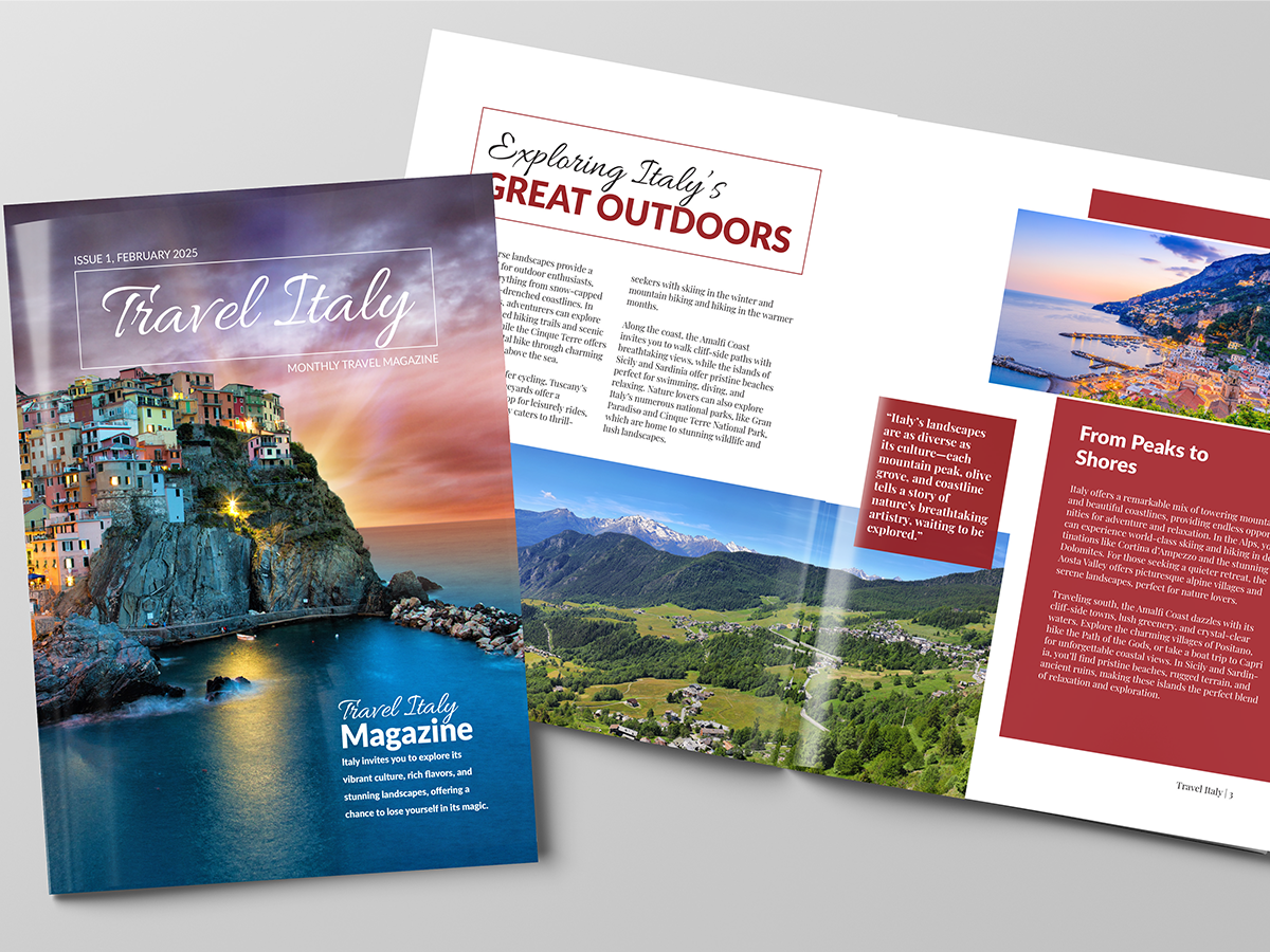
This twelve-page travel magazine brings Italy’s culture and landmarks to life by blending bold photography with clean, modern typography. I built the layout using a solid grid system, which helped organize a large amount of information clearly and effectively, making it easier for readers to follow.
To give the project a modern edge, I adapted the entire design into a digital magazine format, ensuring the branding stayed consistent across both print and screen. The physical version was hand-cut and assembled to guarantee a high-quality, tactile finish, and then saddle-stitched.
Overall, this project demonstrates a strong understanding of editorial design and the technical skills needed to take a piece of media from a digital concept to a professional-grade physical product.
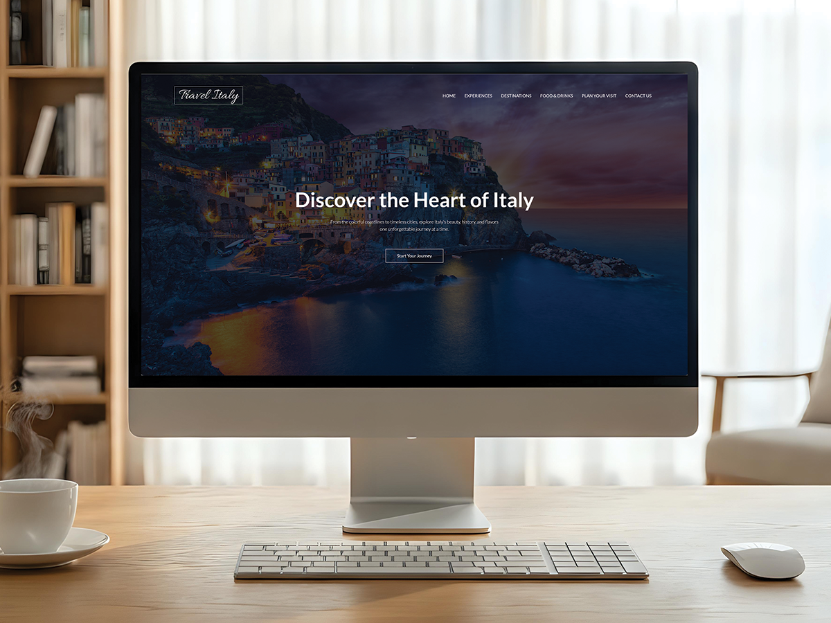
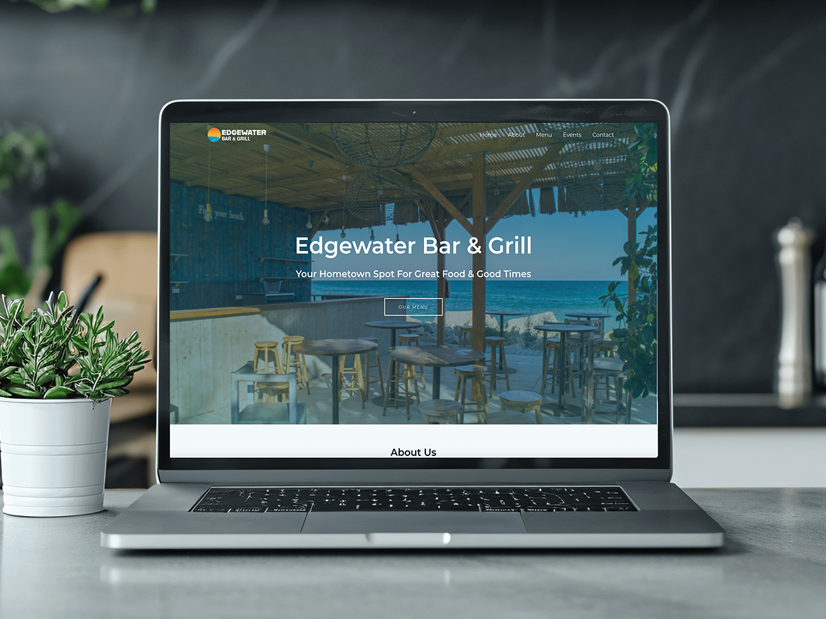
This travel website was designed directly from the layout that I made for the travel magazine, acting as a digital extension that brings the same insights into Italian culture to the web. To keep the branding seamless, I used the same modern aesthetic and clean typography as the original printed pages.
The site was built from scratch using custom code in Visual Studio Code to ensure the user experience was both unique and fully responsive. My main goal for this website was to create an easy-to-navigate resource that highlights the beauty of Italy through a minimalist interface.
Ultimately, this project demonstrates my strong ability to handle front-end development and brand extension by successfully translating complex print layouts into a functional digital environment.
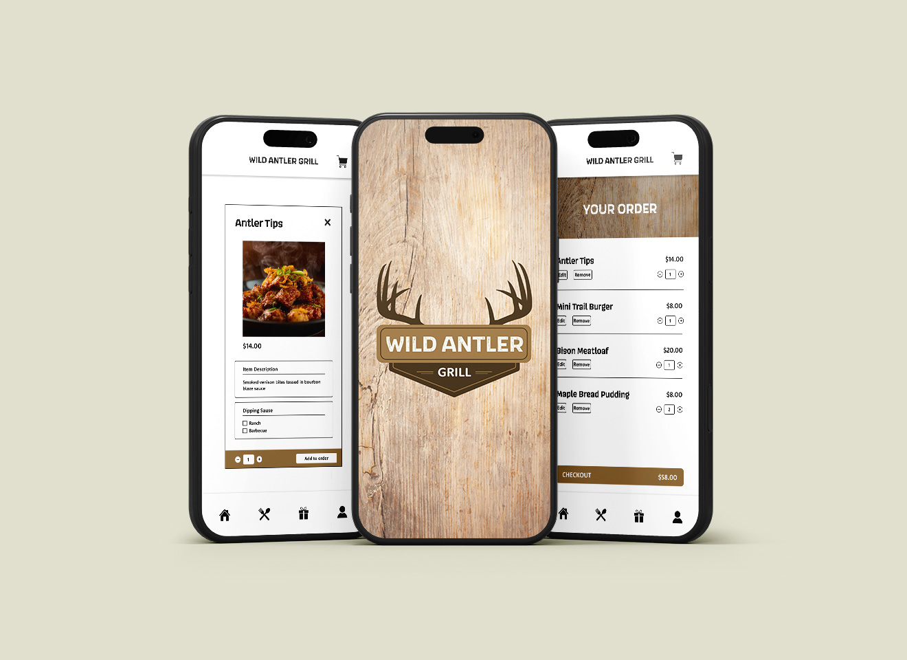
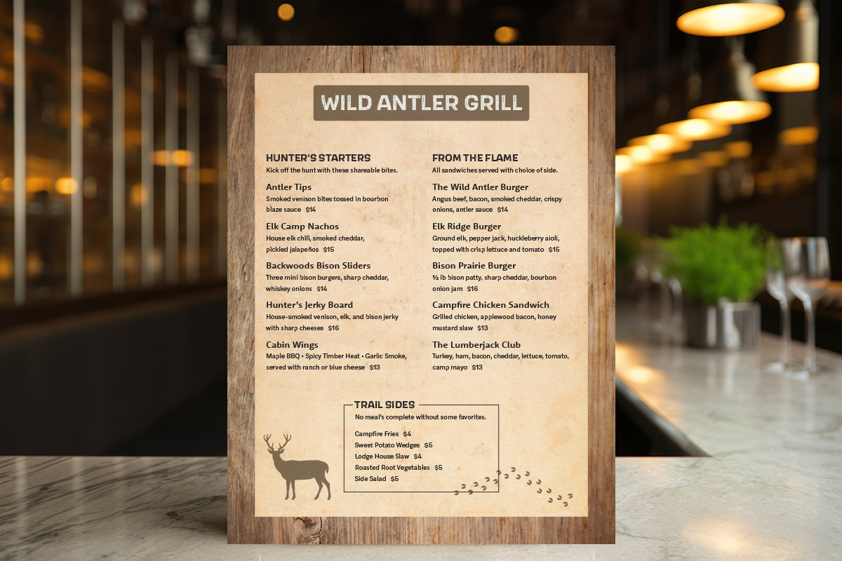
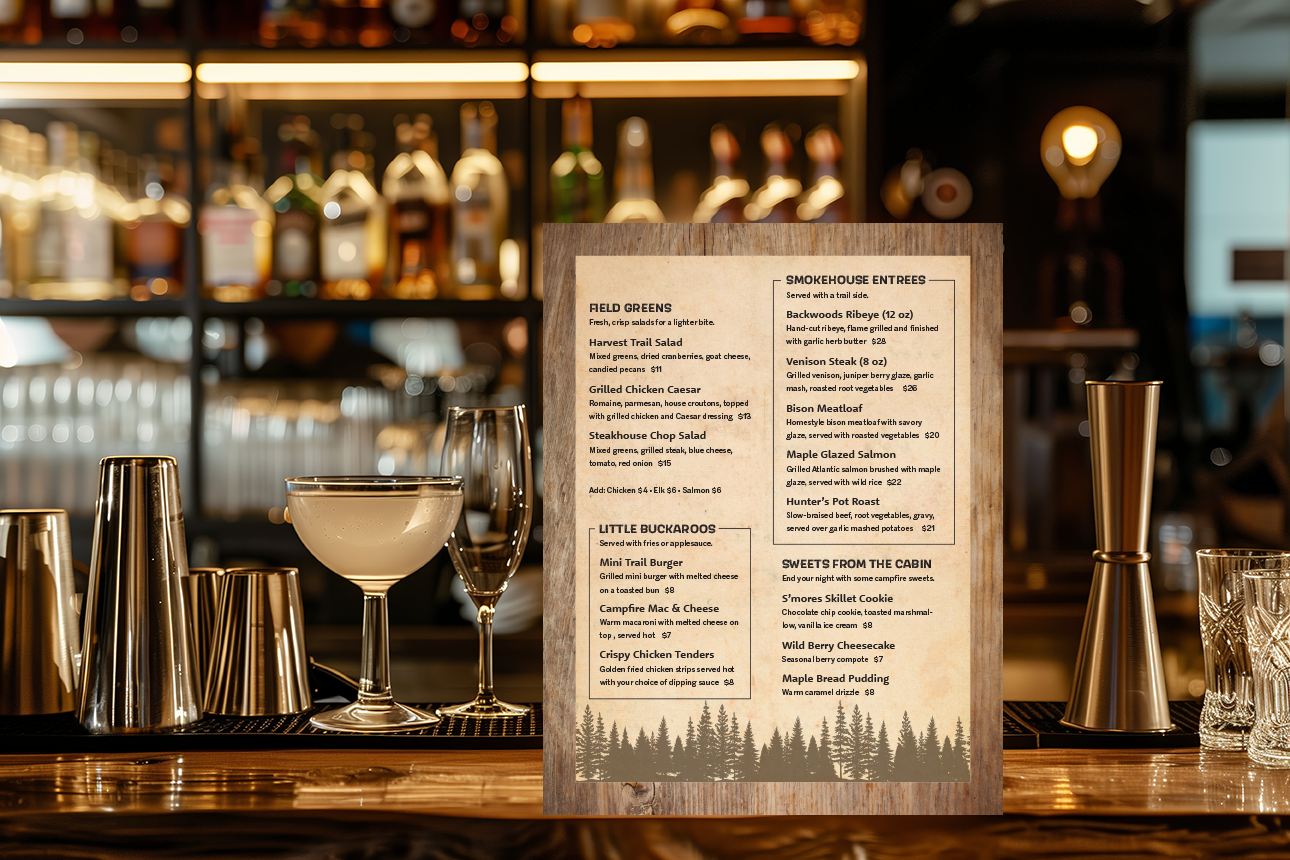
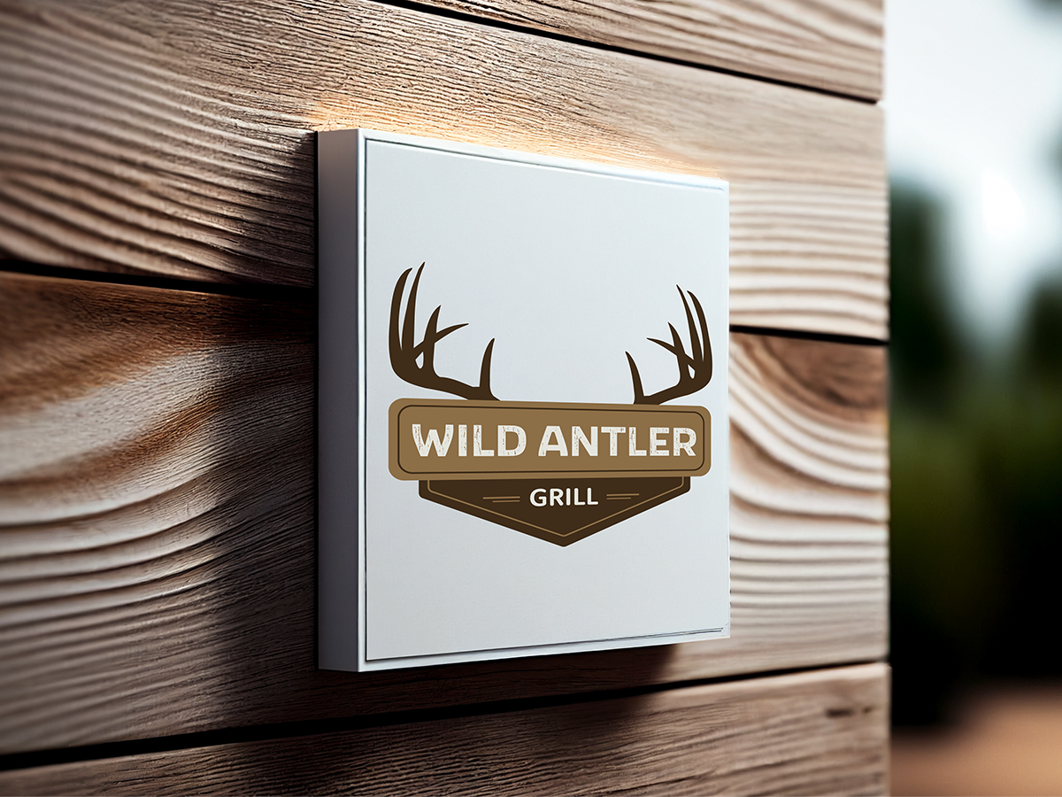
In this branding project, I focused on building the Wild Antler Grill identity from the ground up, starting with the name and moving into a full visual system. To capture a rugged, outdoorsy vibe, I used organic elements like antlers and wood textures throughout.
My primary goal was to ensure brand consistency across all platforms, including a branding board, custom packaging, and a mobile app. Some of the best technical parts of the project involved designing a custom dieline for a hand-assembled utensil pouch and producing a professionally printed menu. By coordinating the design across print, digital, and physical formats, I ensured the branding remained consistent.
This project demonstrates my ability to manage complex identities and bridge the gap between digital design and real-world production.
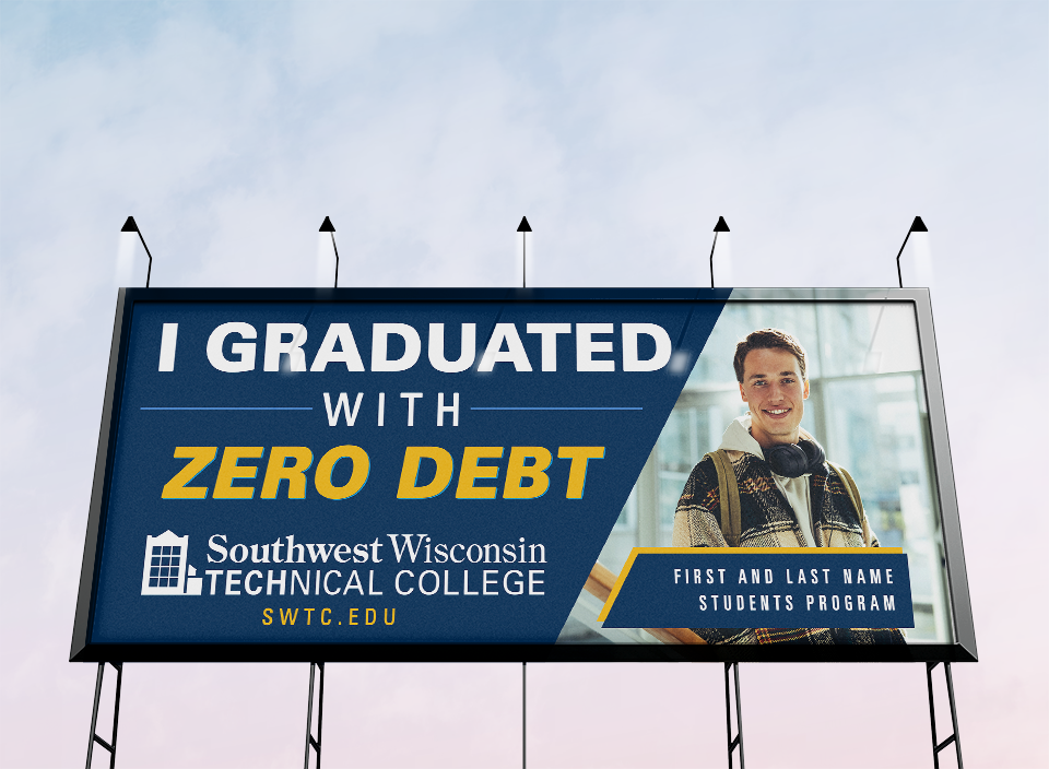
This billboard was designed in collaboration with the marketing team to boost brand awareness throughout the surrounding cities. My focus was to highlight one of the college’s biggest benefits: the chance for students to graduate with zero debt. Since the audience is usually driving by at high speeds, I focused on creating a clean, high-impact layout that is easy to read from a distance.
A lot of strategy went into the large-scale typography and brand consistency to make sure the school’s identity stood out clearly. I balanced a bold message with a minimalist look; the design grabs attention without being overwhelming.This project demonstrates a strong ability to turn big marketing goals into a simple, powerful visual for public advertising.
This website was rebuilt for a client to modernize their online presence and make a stronger first impression. I wanted the design to have a clean, contemporary layout that highlights what the brand offers while keeping the interface easy for anyone to use.
To balance a high-end look with fast performance, I built and launched the final site using an Astra template in WordPress. My main goal was to turn an outdated platform into a streamlined experience that really highlights the brand’s value.
This project demonstrates the ability to take a digital product from the initial idea all the way to a fully finished, responsive website.
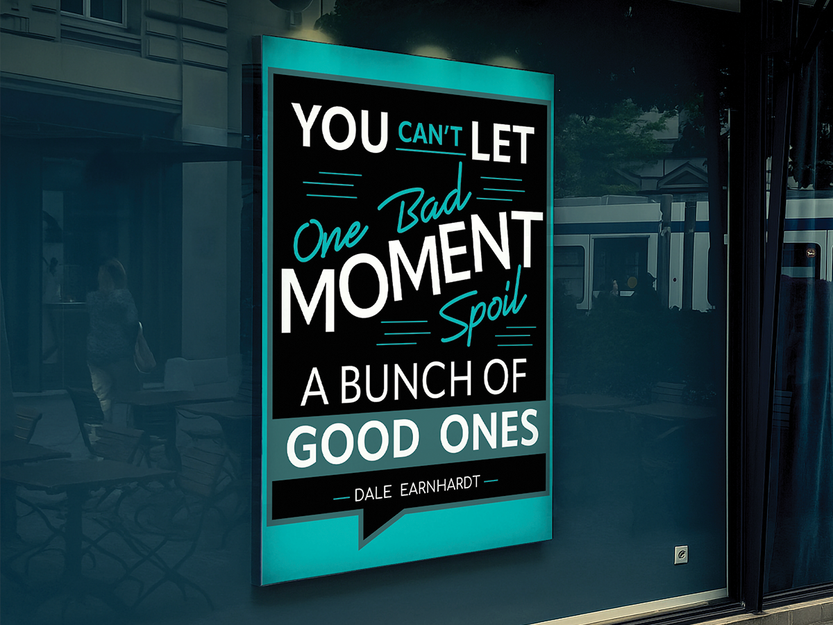
I designed this typography poster as a motivational piece with a focus on a simple, clean layout. The design uses contrasting fonts and colors to make key words pop, ensuring the most important parts of the quote grab your attention immediately.
To make it a professional physical product, the project involved getting everything ready for large-format production, including designing a custom dieline to give the piece a precise and unique shape. The final design was printed on a Roland printer as a high-quality window cling, and I professionally installed it.
Overall, this project demonstrates a great balance between meaningful design and the technical skills needed for a real-world installation.
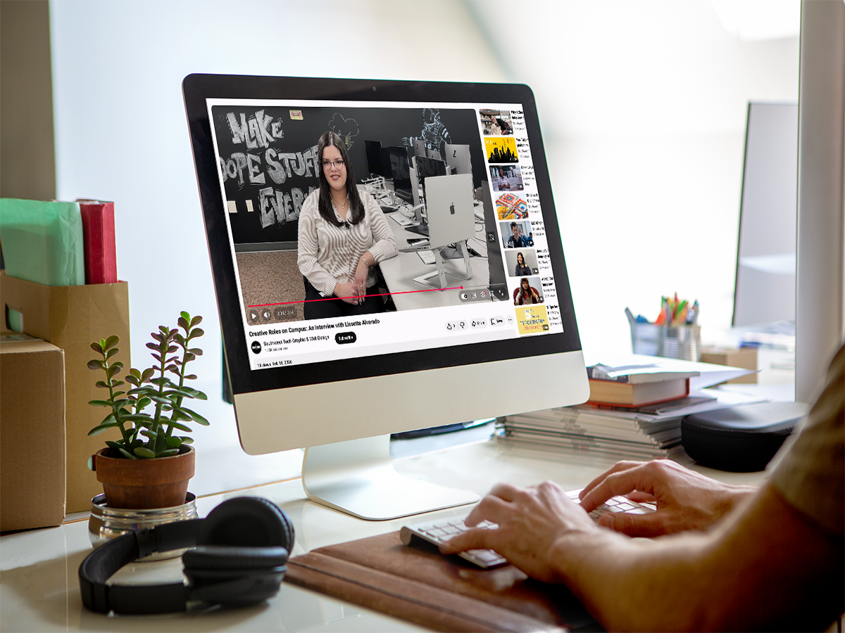
This video project was created as an interview that I posted on YouTube, with a focus on clear storytelling and high-quality production. The process started with a lot of pre-production planning, including writing the script, storyboarding the scenes, and putting together a strategic shot list.
To get a professional result using a mobile phone setup, multiple camera angles and external audio were coordinated and synced up. I captured extra B-roll footage to help make the visual storytelling more engaging. The final edit involved color grading, audio balancing, and refining the narrative to make sure everything flowed smoothly.
This project demonstrates a strong mix of creative direction and the technical skills needed to handle a full video production.
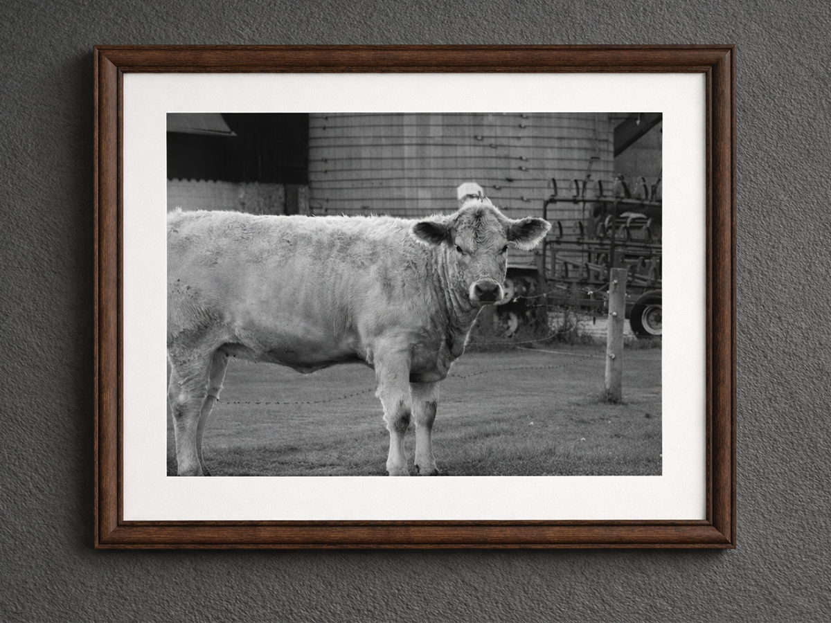
This photography project covers a wide range of subjects, from high-energy sports and wildlife to simple everyday moments. My focus was on using unique compositions and perspectives to encourage people to see familiar things in a new way.
I carefully shot and edited each image to bring out the right details and mood for the subject. To showcase the collection properly, I created a custom website that was designed to present the photos in a clean, professional digital format.
This project demonstrates a solid balance between photography skills, photo editing, and web design.
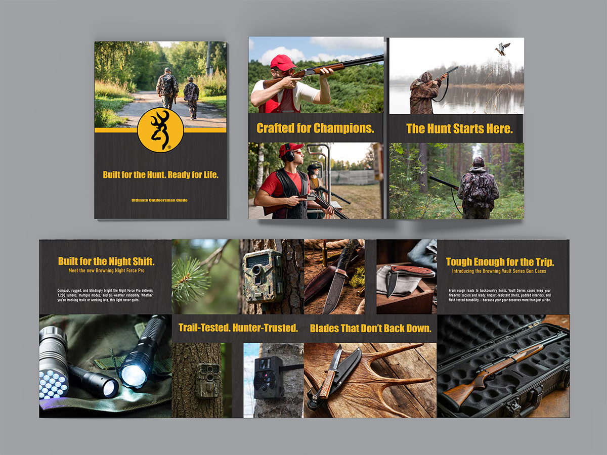
This product guide highlights the Browning brand by using a visual, image-driven layout that lets high-quality photography do the talking instead of using heavy blocks of text.
To match the brand’s rugged identity, I wanted a design that featured wood textures and natural elements throughout the pages. I hand-assembled a gatefold format to make the guide feel more interactive and tactile, allowing the products to take center stage while helping to tell the brand’s story.
This project demonstrates a great balance between creative layout design and the technical skills needed for physical production.
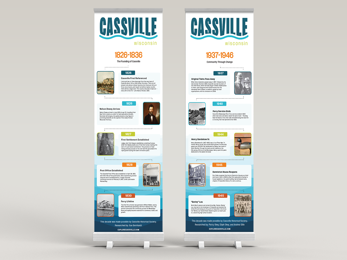
This project involved designing a series of 20 banners for a village bicentennial, which I built to guide visitors through 200 years of local history. The layout uses an alternating left- and right-aligned design strategy to create a steady visual rhythm as people walk past the banners at the event.
To make the history easy to follow, my focus was on organizing a large amount of provided data and old photos into a clean structure. Each banner features its own timeline segment, which required careful typography and layout work to make sure decades of information stayed readable and balanced. Since these were made for high-visibility outdoor display, I prioritized a smooth chronological flow and consistent branding.
This project demonstrates my ability to manage a large-scale design task while keeping historical storytelling clear and professional across multiple pieces.
Social Media
Project Overview
Adobe Express
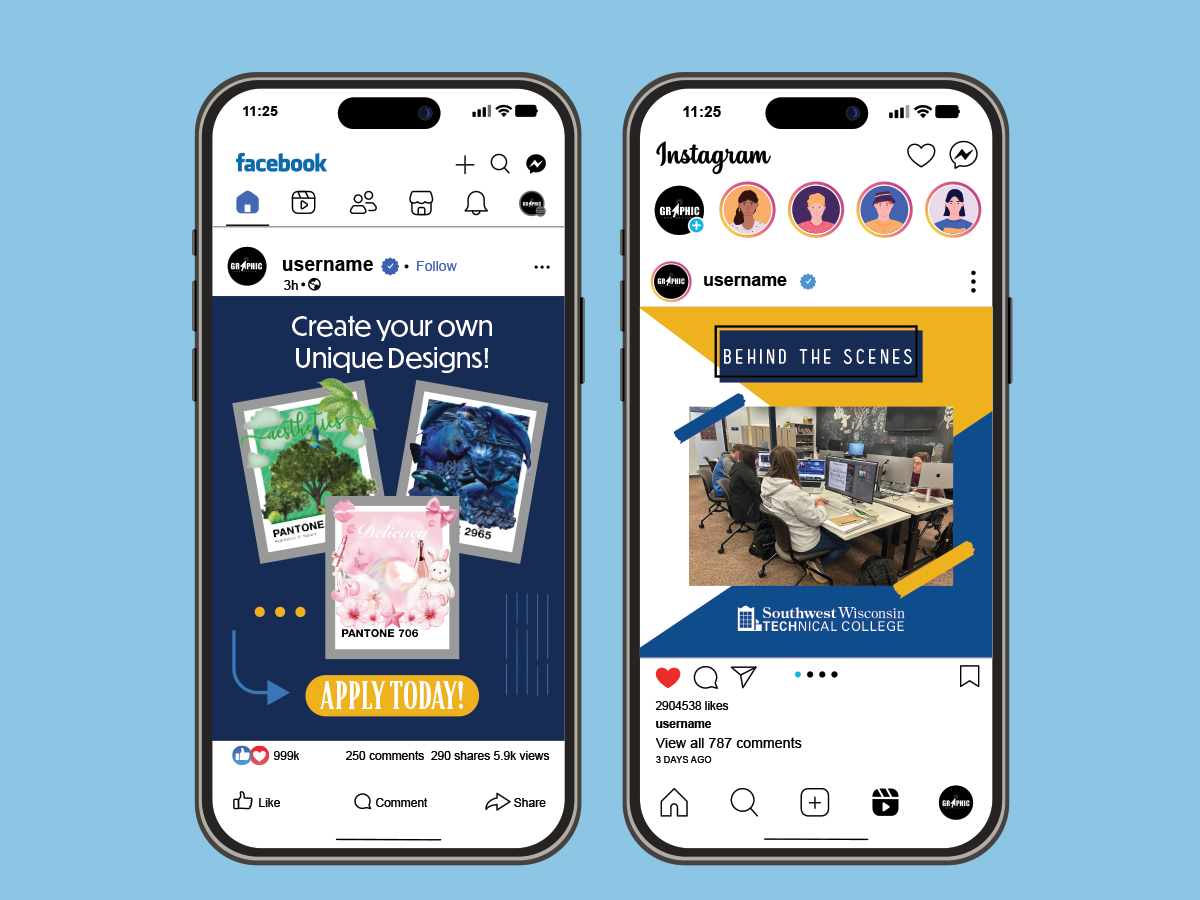
I created this series to boost engagement and get more people interested in the Graphic and Web Design program. I wanted to focus on showcasing real student work and the collaborative vibe of the classroom to help attract new students.
By sticking to the college’s official branding and color palette, the designs stay consistent across every digital platform. I created these for Instagram and Facebook, using a mix of static posts and short-form video to keep things interesting.
Overall, this project demonstrates a solid understanding of social media strategy and how to create branded content that connects with an audience.